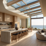
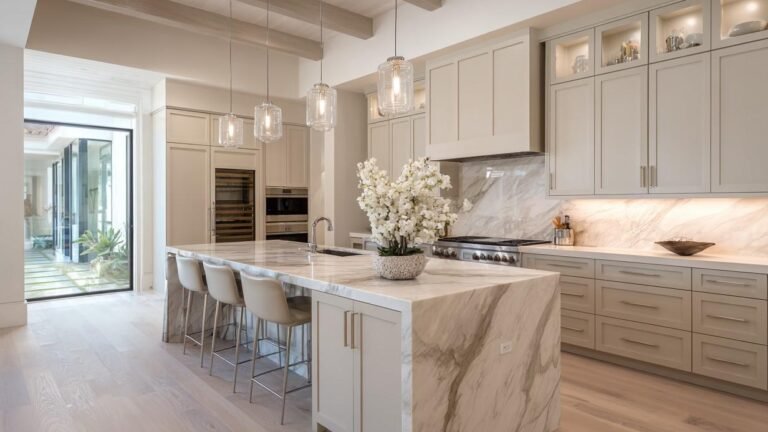
Cream kitchen cabinets are a favorite among designers—and for good reason. They offer warmth, softness, and versatility that white cabinets sometimes lack.
Unlike bright white, cream feels cozy. It has a slightly yellow or beige undertone that makes a kitchen feel more inviting.
But here’s the real magic: cream kitchen cabinets act like a blank canvas. You can pair them with all kinds of colors and materials to get completely different looks—modern, farmhouse, elegant, or rustic. The key is choosing the right colors to go with your cream cabinets.
Let’s explore the most-loved color pairings that top designers use again and again. These combinations will help you build a kitchen that feels balanced, beautiful, and timeless.
Why Designers Love Cream Cabinets
Designers love cream because it works in so many homes. Whether you’re remodeling a city apartment or updating a country farmhouse, cream cabinets bring a softness that blends well with almost every design style.
Here are a few reasons designers keep coming back to cream:
- Neutral but warm: It doesn’t feel cold or sterile like plain white.
- Hides smudges: Slightly darker than white, so it’s more forgiving.
- Style-flexible: Goes well with modern, rustic, traditional, or eclectic styles.
- Timeless look: It won’t go out of style in five years.
Now, let’s dive into the top color combinations that designers are pairing with cream cabinetry.
1. Cream + Warm Wood Tones
This combo never goes out of style. Cream cabinets and natural wood elements—like oak, walnut, or maple—create a warm and welcoming kitchen that feels grounded and earthy.
Why It Works
The soft tone of cream highlights the natural beauty of wood grain. It adds depth without overwhelming the space. Wood brings texture, while cream adds lightness. Together, they create a cozy and timeless feel.
How to Use It
- Choose a butcher block countertop to pair with cream lower cabinets.
- Add wooden open shelves for warmth and a natural touch.
- Use light oak flooring to keep things airy, or dark walnut floors for contrast.
- A wooden dining table or bar stools can tie the whole space together.
This pairing works especially well in farmhouse, cottage, or Scandinavian kitchens.
2. Cream + Matte Black
Matte black is bold. Cream is soft. Together, they balance each other perfectly. If you want to give your kitchen a modern edge without making it feel too cold, this is the combo to try.
Why It Works
Matte black brings contrast and strength. Cream softens it and keeps the space from feeling too dark. This pairing is sleek, fresh, and stylish.
How to Use It
- Add matte black cabinet hardware (like knobs and handles).
- Choose black light fixtures above the island or dining table.
- Try a black kitchen faucet for a dramatic focal point.
- Go even bolder with a black kitchen island surrounded by cream cabinets.
This pairing works best in transitional or modern kitchens, where you want to mix classic and contemporary elements.
3. Cream + Soft Gray
Gray and cream make a subtle, calming duo. This combo is ideal if you want a peaceful kitchen that feels light and airy but not too plain.
Why It Works
Soft gray brings a cool tone to balance the warmth of cream. It makes the kitchen feel elegant and upscale. Gray is also a neutral, so it doesn’t fight for attention.
How to Use It
- Paint the walls a dove gray or pearl gray.
- Choose gray stone countertops (like quartz or marble).
- Add gray tile flooring for a smooth, modern finish.
- Use gray window treatments or fabric chairs for a polished look.
This color combo is perfect for minimalist or classic kitchen styles.
4. Cream + Sage Green
If you love nature-inspired spaces, sage green and cream are a dream team. This pairing feels calm, earthy, and fresh without being trendy.
Why It Works
Sage green is soft and muted. It brings a gentle hint of color that complements the warmth of cream. It gives the kitchen a natural, organic feel.
How to Use It
- Paint a feature wall or backsplash in sage green.
- Use green-tinted subway tiles behind your stove.
- Decorate with plants or herbs in terracotta pots.
- Choose sage-colored bar stools or accessories.
This color pairing shines in cottagecore, farmhouse, or boho kitchens.
5. Cream + Navy Blue
Navy blue is bold, but when you pair it with cream, it becomes classy and balanced. It adds depth without making your kitchen too dark.
Why It Works
The Navy provides a strong contrast. Cream lightens the look. This creates a striking visual balance that feels both fresh and elegant.
How to Use It
- Paint your kitchen island navy to make it stand out.
- Use navy blue tile as a backsplash or accent wall.
- Add navy curtains, bar stools, or rugs to tie the room together.
- Use gold or brass hardware to elevate the entire look.
This is a great combo for transitional or coastal kitchens.
6. Cream + Terracotta or Rust
For a cozy, earthy look, terracotta or rust colors bring warmth and a Mediterranean touch. These tones make the kitchen feel rich and grounded.
Why It Works
Terracotta shades echo the natural tones of clay, stone, and earth. When placed next to cream, they pop without being too loud.
How to Use It
- Install a terracotta backsplash for rustic charm.
- Paint a wall in a rusty orange or clay red.
- Add textiles like cushions, curtains, or rugs in terracotta tones.
- Use earthenware dishes and pottery for added texture.
This combo works best in bohemian, rustic, or Tuscan-style kitchens.
7. Cream + Dusty Blue
This pairing is for anyone who loves a soft, beachy vibe. Dusty blue is relaxed and subtle, and when paired with cream, the effect is light and dreamy.
Why It Works
Dusty blue adds a hint of color without overpowering the space. It cools down the warmth of the cream just enough for perfect balance.
How to Use It
- Paint the backsplash or lower cabinets in dusty blue.
- Add blue ceramic tiles behind the sink.
- Choose textiles and dishware in soft blue shades.
- Mix in light wood tones for a coastal finish.
This pairing is perfect for coastal, cottage, or Scandinavian kitchens.
8. Cream + Greige or Taupe
If you want a monochromatic palette with a little twist, try greige (a blend of gray and beige) or taupe. These shades pair beautifully with cream and add dimension.
Why It Works
They’re close to cream on the color wheel, but just different enough to add depth. The result is a soft, layered look that feels sophisticated.
How to Use It
- Paint walls or trim in light greige or taupe.
- Use taupe countertops or tile flooring.
- Add linen curtains, rugs, or accessories in soft neutrals.
- Mix matte and glossy finishes for added interest.
This pairing suits minimalist, Japandi, or organic modern kitchens.
9. Cream + Charcoal or Slate
Charcoal gray and slate tones give your cream kitchen a dramatic upgrade. If you like a bit of mood and contrast, this is the combo for you.
Why It Works
Dark grays add depth and make cream pop. The result is a balanced kitchen that feels rich and stylish, but not too dark.
How to Use It
- Use slate gray countertops or backsplash tiles.
- Paint the island or lower cabinets in charcoal gray.
- Try a dark stone or soapstone sink.
- Use black or bronze accents to complete the look.
Perfect for industrial, modern farmhouse, or dramatic kitchens.
10. Cream + Blush or Rose
This one’s a little unexpected, but designers are loving it. Blush pinks and rose tones add warmth and a subtle pop of color.
Why It Works
Blush is soft, romantic, and complements the warmth of cream without being overwhelming. It brings a playful energy to the kitchen.
How to Use It
- Use blush pink tiles for a charming backsplash.
- Add rose-colored chairs, dishware, or lighting.
- Keep most of the room neutral and add pink as a subtle accent.
- Use brushed gold or brass finishes to enhance the warmth.
This combo works well in romantic, vintage, or Parisian-inspired kitchens.
Bonus: Cream on Cream Done Right
Want a clean and airy kitchen? Go all-in on cream—but vary the textures and tones. It’s not boring when done right.
Why It Works
By layering different shades and finishes of cream, you create a monochrome space with depth. It feels luxurious and elegant.
How to Use It
- Use matte cream cabinets with glossy cream backsplash tiles.
- Choose off-white stone countertops.
- Mix in brass or gold finishes for sparkle.
- Add texture with woven baskets, linen fabrics, or ceramics.
This combo is great for minimalist, luxurious, or modern kitchens that don’t want too much color.
What About Hardware and Metal Accents?
Choosing the right metal finish is the cherry on top of your cream kitchen design.
Best Matches:
- Brushed brass: Warm and luxurious
- Matte black: Bold and modern
- Antique bronze: Rustic and classic
- Polished nickel: Clean and timeless
- Copper accents: Unique and warm
Hardware can change the feel of your kitchen. Choose finishes that match your overall vibe—whether soft and subtle or dramatic and bold.
Final Thoughts
Cream kitchen cabinets are more than just a safe choice—they’re a smart one. They bring warmth, timeless style, and flexibility to your space.
And when paired with the right colors, they can transform your kitchen into something truly special.
Whether you want soft and serene or bold and dramatic, cream works. Try one of these designer-approved color pairings to create a kitchen you’ll love for years to come.